
A faceless TikTok creative needs a visible subject and a repeatable way to explain it. Finch’s seasonal-challenge post uses a character, familiar actions and completion cards to make a feature concrete. The example is branded animation, with an inspectable relationship between the scene and the product.
Finch: show the feature without a talking head
Compare the animated action with the goal card next to it. The connection between them is the part worth borrowing for another product.
- FORMAT
- Animated action → task card → completion
- PRODUCT’S ROLE
- The feature’s goals and completion cues remain visible inside the animation.
An app user who needs to understand what a seasonal challenge involves.
- 01
Make the feature concrete
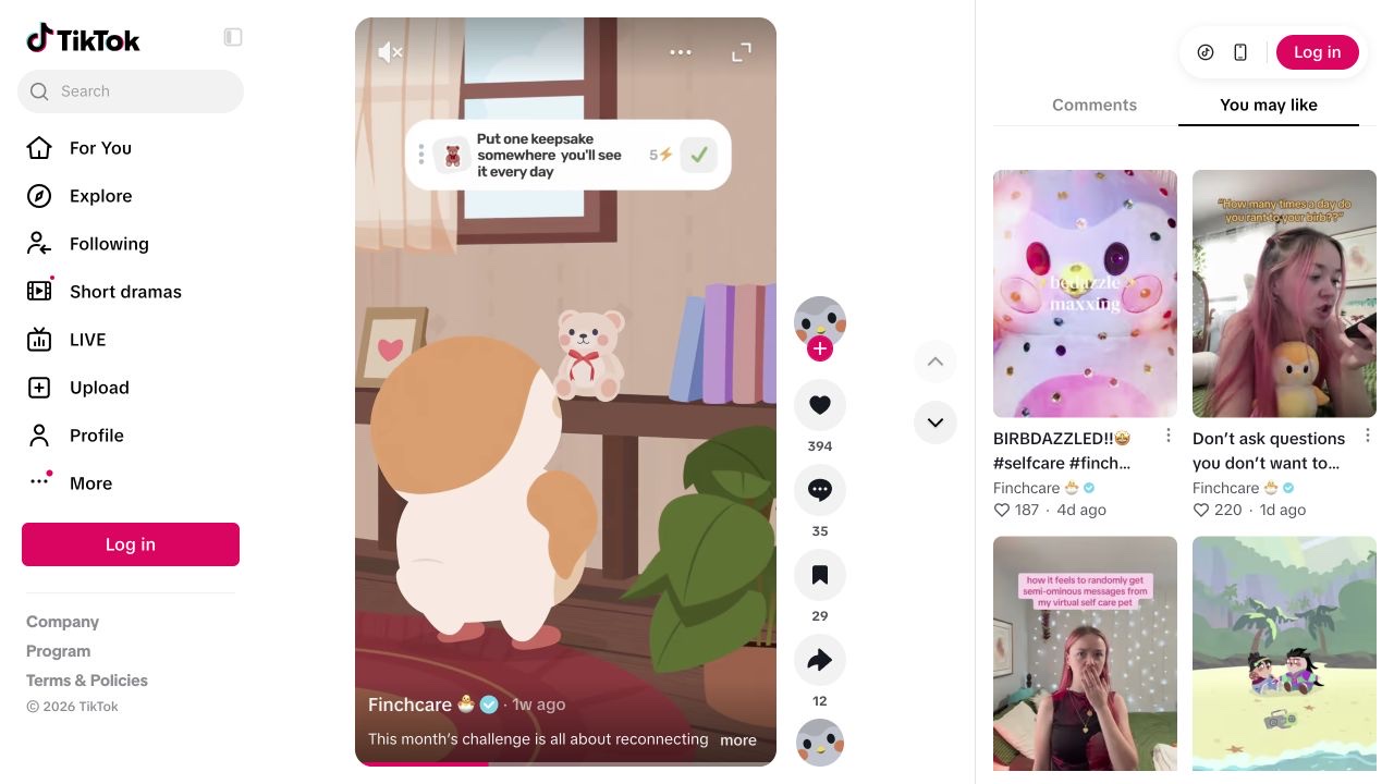
A seasonal challenge title introduces an illustrated bird, followed by a scene involving a keepsake.
Our read. The scene gives the feature an action instead of introducing it as a bundle of benefits. The visual is branded animation, so it should be read as explanation rather than proof of a live tap sequence.
- 02
Connect the scene to the interface
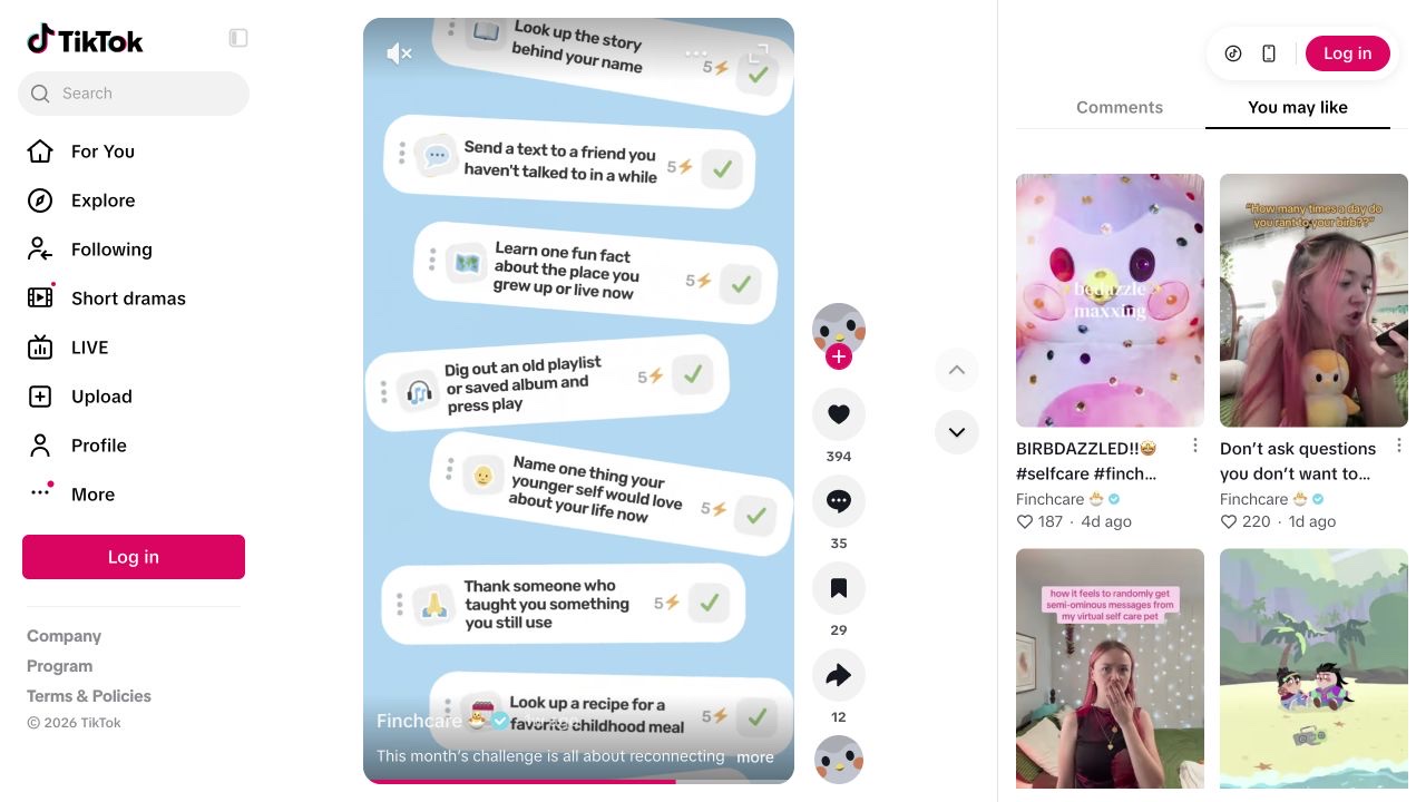
A goal card appears alongside the action and receives a checkmark.
Our read. The card connects the story to a recognisable product element. It keeps the animation from floating free of the thing the account is explaining.
- 03
Repeat a legible rule
Several goal cards with completion cues lead into reward imagery, including a tree-shaped badge.
Our read. The same action-to-completion relationship can organise multiple examples. Repetition helps explain the feature; it does not tell us how many viewers completed a goal or returned to the app.
Give a faceless format something real to demonstrate.
Original brief for a habit-tracker feature explainer. A proposal to test.
“Here is what completing one small goal looks like.”
- Show on screen
- Animate one ordinary task next to a truthful representation of your app’s goal card. Show how the card changes when complete. If this is an animation, label it as an explainer and keep the actual interaction requirements accurate.
- Keep the mechanism
- A visible link between action, interface state and outcome.
- Make it yours
- Use your own character, graphics and product flow. The useful structure is not permission to reuse Finch’s artwork.
- What to record
- Compare which goal examples produce questions about the feature. Distinguish video engagement, feature use and longer-term retention in your own records.
Source & observation notes
An animated Finch bird acts out a seasonal challenge. Goal cards receive checkmarks; later scenes show multiple goals and a tree-shaped reward badge.
One recurring visual grammar connects a task, its completion and a reward. The product remains the subject while animation supplies the movement.
This is branded animation with feature UI cards, not a live app walkthrough or UGC. No claim about organic reach, paid amplification, conversions or health outcomes is supported.
Playback started and visual sequence inspected on 9 September 2026. Muted observation; no audio transcription or product test. Source checked 2026-09-09. Source 1 ↗ Source 2 ↗
01STORY BRIEFThe idea in three screens.3 SCREENS

A format needs something real to explain.
Finch turns a seasonal challenge into a sequence of actions and goal cards. A practical look at faceless content that keeps the product visible.
Removing the presenter does not remove the editorial job. Somebody still has to decide what the viewer should recognise, what changes on screen and why the next scene belongs there. Finch’s post gives those decisions a simple structure: an ordinary action, a corresponding goal card and a completion cue. The same visual language can carry several examples without changing the subject.
That makes the clip useful to study alongside creator-led app demonstrations. One relies on a person explaining a problem; the other uses an animated world and interface elements. Both give the product a concrete role. Choose between those approaches by asking which can show your actual workflow clearly and which your team can maintain, rather than treating faceless content as an excuse to ship interchangeable slides.
Give each scene a job in the feature explanation.
The keepsake scene works as an explanatory unit because the action and the card belong to the same idea. The viewer can connect the scene to the completion cue without learning an entirely new visual system. A useful creative brief would record that relationship, then list the next actions that can fit it. This is how a format becomes repeatable at the level of meaning. Merely exporting more scenes in the same colours would preserve the styling while leaving the story without a rule. Keep a small storyboard that shows the action, the corresponding product element and the reason the transition belongs there.
From a daily action to a visible completion cue
- 01Action
Choose an ordinary situation the viewer can recognise.
- 02Product element
Show the goal or feature that corresponds to it.
- 03Changed state
Make completion visible without inventing a result.
- 04Next example
Repeat the relationship with a distinct situation.
Editorial model: a way to reason about the process, not measured platform results.
Animation gives an editor control over emphasis, but it also changes the kind of evidence on screen. The Finch clip illustrates a feature through designed scenes and UI cards. It does not let us test the real interaction, its loading state or any eligibility rules. For your own product, decide which explanation the viewer needs. An animation can clarify a concept; a screen recording can show where to tap. If you combine them, make the handoff legible and keep both faithful to the current product. A beautiful scene that implies a feature you do not offer creates a support problem after the view.
A reusable format also needs a production budget. List the assets the next episode would require: the character or narrator, the interface state, the motion, any sound and the product facts that need checking. A format that needs a new miniature film every week may be worthwhile, but it has different economics from a screen recording. Keep source files and label their relationship to the shipped version. That makes a correction possible when a feature name or interface changes, and it stops the team from confusing a folder of polished exports with a maintained publishing system.
To adapt the structure, sketch three goal examples for a product you actually use. Give each one a recognisable action and a true completion state. Keep the visual grammar fixed while the situation changes. You can then ask a useful creative question: which situation makes the feature easiest to understand? If you change the character, pacing, opening claim and goal at once, the next result will tell you much less about the source of the difference. This is a proposed experiment, so write the comparison and observation window before any posts go live.
An account can carry this format as one part of its editorial promise. Other posts may need a person, a screen recording or a direct answer to a user question. Keep those decisions connected to the audience’s task. At publication, check that the caption calls the asset what it is and that the link leads to the feature being explained. The TokPortal workflow below shows how a video slot can hold the media, caption and schedule together. It cannot convert an animated scene into proof of a live product interaction; that distinction belongs in the creative review.
From the idea to the actual workflow.
Product screens, documented tools and a practical way to connect them.
Prepare the actual video slot, not just the caption
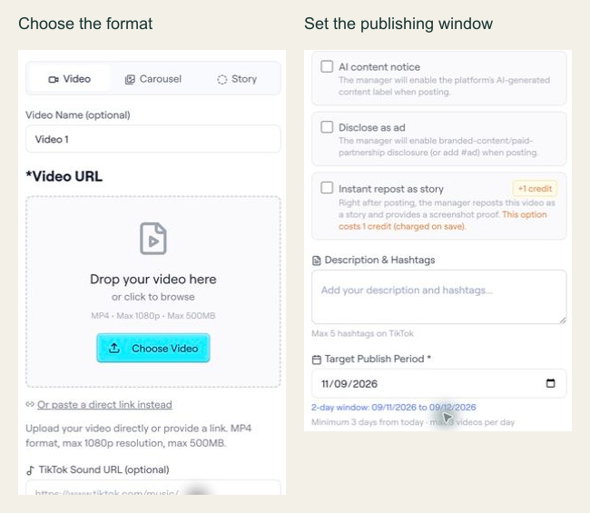
TokPortal’s editor distinguishes Video, Carousel and Story, and asks for a target publishing period. The API follows the same operational idea: the content needs a valid format, accessible media and a usable window.
PUT /api/ext/bundles/{id}/videos/{position}{
"tool": "tokportal_configure_bundle_video",
"arguments": {
"id": "<real-bundle-uuid>",
"position": 1,
"body": {
"video_type": "video",
"video_url": "<public_url returned by your video upload>",
"description": "A practical example of organising freelance subscriptions.",
"target_publish_date": "<valid future date: YYYY-MM-DD>"
}
}
}Replace the marked values with your actual upload and bundle. This template is intentionally not a runnable campaign. target_publish_date starts a two-day publishing window; it does not request an exact minute.
- 01Choose the correct media fields
A video needs video_url and description. A TikTok carousel instead needs carousel_images and tiktok_sound_url.
- 02Use a valid window
Allow at least three days while account creation is pending, or one day for delivered/existing accounts. Check the current response and limits.
- 03Inspect readiness
GET /api/ext/bundles/{id}/publish-readiness lists blockers without a debit or mutation. Review ignored_fields and the returned start/end dates.
“A format needs something real to explain.”
02FIELD KITFrom concept to practice.4 SCREENS
Choose one feature and one ordinary action that makes it understandable.
Adapt this to your audience, budget and test scope.
Put it to work.
- 01Choose one feature and one ordinary action that makes it understandable.
- 02Keep the same interface cues across scenes and show a truthful completion state.
- 03Label animation as an explainer when it does not show a live interaction.
- 04Review the asset, source files, publishing destination and observation window together.
Notes & sources.
The limit. The Finch video is an animated feature explanation. Its public page does not establish paid versus organic distribution, feature adoption, retention or health outcomes.
Further reading is linked throughout this article. Worked examples explain a process; they are not campaign results.
THE ORGANIC CLUB is an editorial project initiated by TokPortal. That relationship is separate from the evidence behind claims. Editorial signatures and image credits are explained in our policy. Our editorial policy →


.jpg)